Flyers are an effective way to get the word out about planned events. It is essential to use engaging messaging, an eye-catching design that is on brand and resonates with the audience, and a clear call to action to maximize the functionality of the flyer.
Follow the principles below to promote your event successfully.
Attention-grabbing headline
The headline should be the first thing people see. Its job is to compel the audience to keep reading and learn more. Draw attention by making it as catchy, fun, or exciting as possible. You could lure the audience in with a question, a short and simple statement, or just one or two impactful words.
Visual Hierarchy
Hierarchy is vital in introducing essential information quickly and effectively. Example components for the highest-level content include a title, the date(s), time(s), location(s), and call to action(s). The more prominent these items are, the more they attract the audience.
When establishing hierarchy, use large fonts AND a large amount of page real estate to achieve the proper prominence. Grids are an excellent way to combine the two. Here are a few good examples of visual hierarchy grids for flyers.


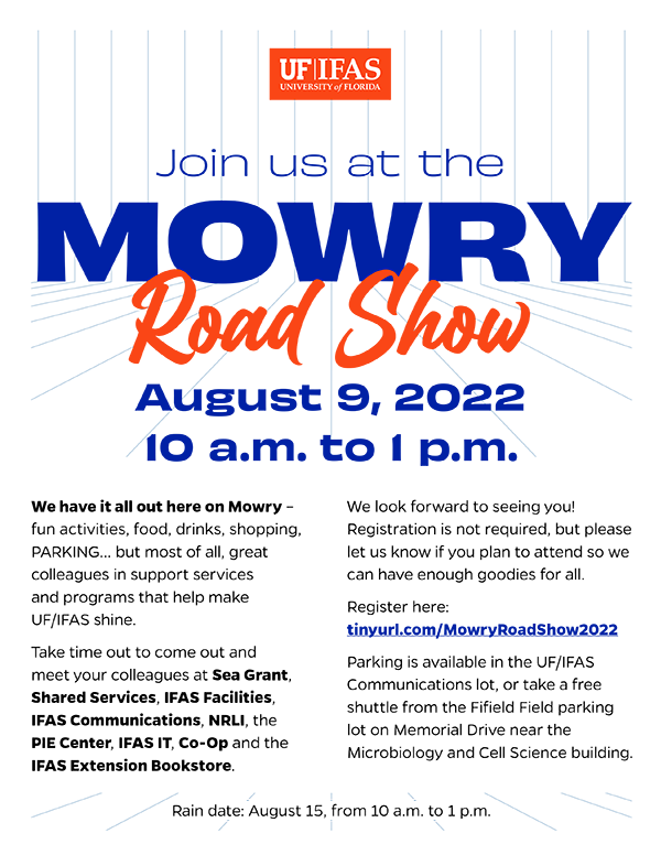
The example below uses visual hierarchy to catch the reader’s attention. Not only is the headline prominent, but the perspective lines in the background guide the eye to all essential information quickly and effectively.
Balance carries weight
The audience needs essential information to be excited about what you are promoting; however, they don’t need overwhelming content. Resist the temptation to add every detail; less can be more. Having “white space” around content and graphical elements keeps things balanced, uncrowded, and gives the reader space to digest the information. Balance the content using organization and proportion to other elements on the page.
The Farm Field Day flyer below shows a good balance of content. The photos take up a large portion of the top, while the designer used smaller body text to prevent the layout from becoming too overwhelming.

Typography the right way
The UF branding guide provides the fonts to use on our layouts, but that doesn’t mean creativity takes a backseat. The branding fonts (Gentona, Obviously Wide and Extended, and Billion Dreams) can convey multiple feelings to reinforce any message to the audience.
- Gentona is a modern, clean font that works as headers and body content. Its simplicity pairs well with the more expressive typefaces of Obviously and Billion Dreams.
- Obviously Wide and Extended are blocky, striking, and work best for emphasizing Titles and headers.
- Billion Dreams is elegant and expressive and can highlight specific keywords.
The Ag-Xtension Fall Festival flyer below shows how well all the fonts work together. The designer used outside-the-box, creative thinking by outlining Ag-Xtension using Obviously Wide and placing a solid drop shadow behind it to emphasize and bring attention to the program.

Need help getting started on your own?
Check out our DIY templates to help get the creative juices flowing.
For more tips on creating your pieces on your own, see our blog posts below:
 3
3
