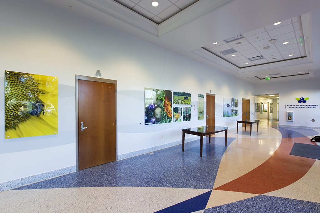
The purpose of the UF/IFAS Extension Straughn Professional Development Center environmental graphics project was to convey a message about what UF/IFAS Extension does, visually, to the many diverse audiences that visit the event space on a daily basis. There was a need for a fresh and updated look since the center has had the same decor for several years.
Some of the challenges we faced with this project are listed below:
- The designer was asked to copy the abstract pattern currently on the floor to the walls. The challenge was to not overwhelm the space with graphics. A subtle wave pattern was designed on vinyl and adhered to the length of the lobby wall (76ft long x 4.5ft tall). Matching the colors of the wave to the paint color on the wall was difficult as paint and print colors don’t always match. The designer made multiple visits to the center, with many color swatches in hand, at various times of the day to determine what would look the best with different lighting.
- Narrowing all of what UF/IFAS Extension does to 25 photos was also a challenge. We ended up with just the right photos that represent a multitude of Extension programs.
There are many textures and textiles in play in the new look:
- vinyl wall wrap that spans the entire length of the main lobby floor (76ft),
- vinyl lettering and photos adhered to the wall, elevator door and windows,
- brushed and painted aluminum letters mounted to the wall with metal spacers to give depth and
- 16 large acrylic photos ranging in size from 70” x 47.5” to 23.5” x 18.5”
If you haven’t seen the new look yet next time you are on campus or in the area stop by and take a look it really is impressive.


 0
0
