You may not realize it, but every website is built on rectangles and squares. Sophisticated websites may give the illusion that this pattern does not exist, but each website is identical under the hood – rectangles, and squares. Squares, rectangles, margins, gutters, and modules reveal a grid system under the hood. When rectangles and squares intersect, modules provide space for blocks, images, buttons, etc.
All websites should use a grid for consistency, whether block, column, modular, hierarchical, or a homegrown grid.
Old school web developers may recall the O.G. of grid systems from back in the day, the 960 grid. A grid system helps web builders align page elements based on columns and rows. Grid systems serve as a systematic and standard approach that allows web builders to layout elements in an organized manner and provide a modular design approach (Source). Grid systems commonly use a fixed measurement unit that dictates sizing, spacing, and alignment that constrains each design element on a website.
The 12 Column Grid System
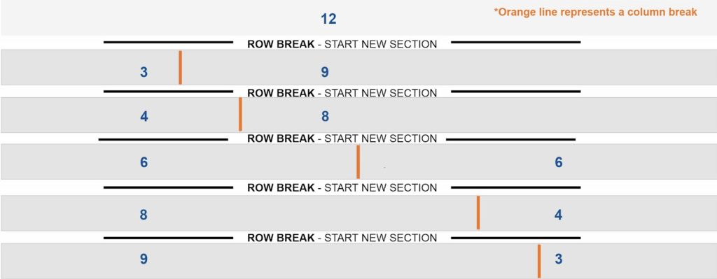
All T4 IFAS websites depend on a responsive 12 column grid system to maintain consistency and flexibility. Using a 12 column grid means design elements can be placed inside one column or across two or more to create various visual layouts. In addition, the grid system makes it easier to create responsive designs that reorder the visual presentation on desktop and mobile. Furthermore, our grid defines the visual white space needed for the eye to rest between elements. Finally, it promotes the rule of thirds, where the focal point of images is in the center.
Many IFAS T4 web builders are familiar with building pages using the complex layout inspired by our grid system. Here is a simple way to understand this visual builder: Complex Layouts are based on rows that contain columns that allow you to create multi-column layouts. Columns contained in rows must equal 12 (i.e., column widths 3,4,6,8,9,12). Columns can hold different types of content pieces.
The complex layout is smart enough to know when Column-blocks does not equal 12 and compensate.

Goal: Expanding The IFAS Website Grid System
IFAS websites will move from 1200 to a 1600 pixel width default system. The goal is to create a more immersive experience. The newly expanded grid will also include:
- Using more ARIA attributes in our code to increase accessibility.
- We are removing weird spacing when nesting multiple Column-blocks within the same Row. The goal is to create a more consistent spacing of elements on web pages by 2023.
This goal sets the stage to nest other content pieces between elements used to build complex layouts.
Look for other IFAS Web Goals 2022 – 2023 upcoming posts.
Resources:
- Center Important Information In Your Slider Graphic
- Center Important Information In Your Blog Image, It Could Affect Your Website
- Tutorial: Using The Complex Layout
References:
 0
0
