What makes a good tri-fold brochure?
Effective brochures catch the eye of the casually interested audience. There should be something about the look and content that stays with the reader. A good brochure can inform, intrigue or inspire people, but it also has to interest them. To be truly effective, it must lead to an action by the reader.
Things to think about when planning
Why
- Why do you need to put the time, effort, and funds into making a brochure?
- Why is it needed now?
- What need will the brochure address?
- Is there a lack of awareness or understanding about your program?
- Are you looking for more funding or trying to recruit new students or faculty?
Audience
- Who do you want to reach?
- What are their demographics?
- Where are they?
Messaging
- What do you want your audience to know?
- Why should the reader be interested?
- Do you want to inform (here we are) or inform and persuade your audience to do something (here we are and why we matter)?
Distribution
- How do you intend to get the brochure to your audience?
- Hand it out in your office or at events
- Part of a larger packet, i.e., a media packet
Anatomy of a trifold brochure


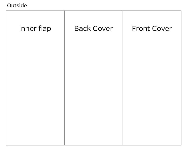
Front cover
The front cover is the front door to your audience. What you put on the front should relate to what is on the inside. Keep it simple and eye-catching.
Back cover
The back cover should contain a call to action, including contact information like a web address or phone number. Additionally, you can add a closing message to finalize the main message.
Inner flap
The inner flap is an extension of the cover and can be highly visual. Use this panel to introduce your program. Alternatively, you can include an answer to something you posed on the front cover, use the acronym from your name and spell it out, or present an interesting quote.
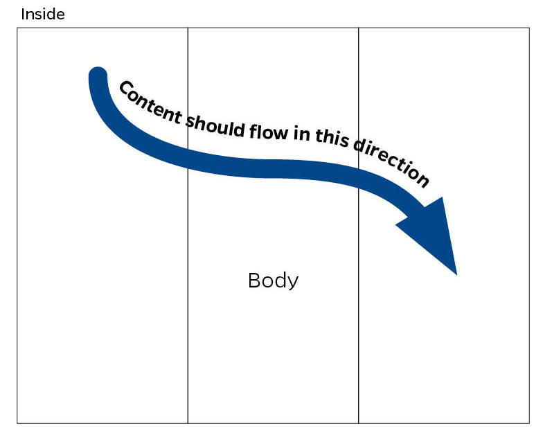
Body
The body of the brochure (inside) should contain the meat of your message. Explain the items that are most interesting to your audience and use wording that visualizes the benefits of your program by using visual language. Another technique is to appeal to your audience’s emotions without seeming manipulative by focusing on the benefits of your program. Use language your audience will understand and is relatable.
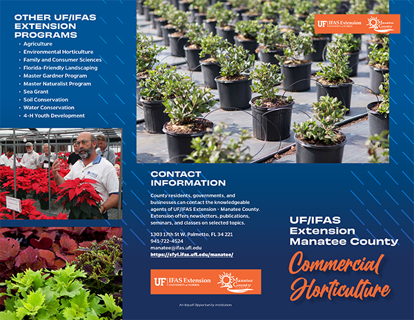
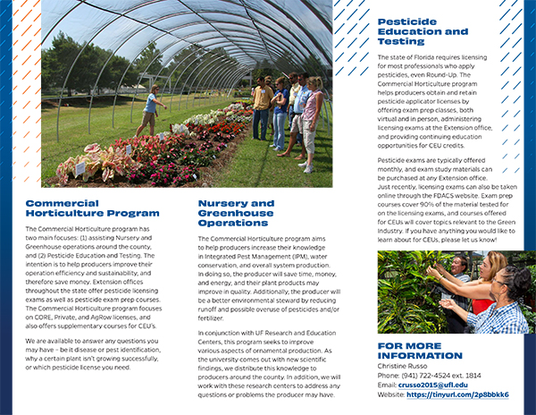
Sample Brochure


Communication Requests
UF/IFAS Communications is here to assist you with designing your tri-fold brochures. We will ensure to follow all current brand standards and that the piece appeals to your audiences.
- Navigate to http://tinyurl.com/ICS-Request-Form
- Login with your Gatorlink credentials
- Click on Request on the top bar
- Click on the blue New Request button (on the right)
- Choose Graphic Design Request in the dropdown menu
- Fill out and submit the form
Featured image by SQS – stock.adobe.com
 0
0
