Have you ever looked at a flyer, webpage, or email and felt overwhelmed, or even unsure where to look first? This is a clear sign that the content lacks a well-structured visual hierarchy. Whether you’re designing a syllabus, a research poster, or a department newsletter, visual hierarchy is your secret weapon for clarity and engagement.
What Is Visual Hierarchy?
Visual hierarchy is the arrangement of elements in a way that clearly signals their order of importance. It guides the reader’s eye through your content by indicating what to read first, what to notice next, and what to remember.
Think of it as storytelling through design. Without saying a word, your layout can emphasize key messages, create flow, and make information easier to process.
Why It Matters in Higher Ed
Faculty and staff often juggle complex information such as course content, research findings, and event details. A strong visual hierarchy helps:
- Make content scannable
- Highlight calls to action
- Improve accessibility
Core Principles of Visual Hierarchy
Here are five key tools you can use to create an effective hierarchy:
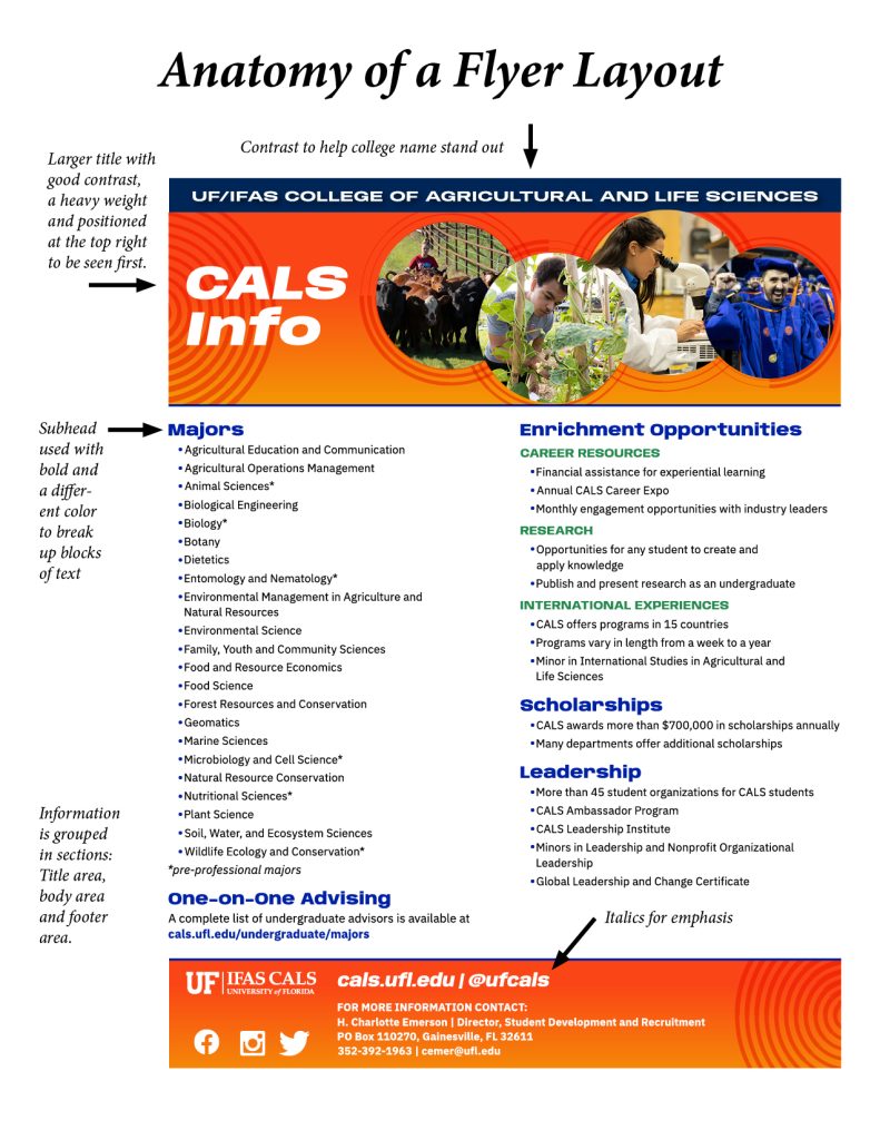
- Size: Bigger elements draw more attention. Use larger fonts for headlines and smaller ones for body text.
- Color and Contrast: High contrast between text and background improves readability. Use brand colors strategically to highlight key points.
- Typography: Use font weight (bold vs. regular), style (italic), and typeface pairing to differentiate headings from body text.
- Spacing and Grouping: White space, also known as negative space, is the empty area around design elements. It is not always white. It can be any background color. It helps group content, improve readability, and guide the viewer’s focus.
- Alignment and Position: Elements at the top or left of a layout are seen first. Use consistent alignment to create a clean, professional look.
Before and After: A Factsheet


Before After
Before
- All text is the same size and color
- No clear headline
- Contact information is buried in a paragraph
After
- The event title is bold and large at the top
- Date and time are highlighted in a contrasting color
- Contact information is in a separate, clearly labeled section
The result?
A flyer that’s easier to read—and more likely to get noticed.
Quick Tips
- Use text styles in Word or Google Docs to structure documents and improve accessibility.
- In emails, bold key dates or deadlines to help them stand out.
- When creating slides, limit each slide to one main idea and use hierarchy to emphasize it.
Need Help? We’ve Got You.
Our communications team is here to support you. Whether you’re creating a poster, updating your syllabus, or launching a new initiative, we can help you apply visual hierarchy to make your message shine.
Submit a request for Graphic Design here: ICS Request Form
 1
1
