Color plays a role in any printed or digital piece’s overall visual feel and readability. It is vital to have good color contrast so that all users, even those with low vision or colorblindness, can interact, read and understand the content.
Color deficiency is the inability to distinguish certain shades of color. For example, some people have red/green confusion, and others have yellow/blue confusion. Color blindness is the inability to see color either partially or at all.
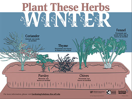
Below is an infographic the ICS design team updated to be ADA-compliant. On the left is the original color scheme, and on the right is the adjusted file that was made ADA-compliant.

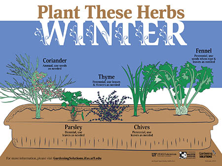
The illustration on the right is more legible, even for those without a color vision deficiency.
Helpful Tools
WebAim is a web-based resource that checks color contrast. This tool ensures that the color contrast meets the minimum WCAG-compliant requirements.
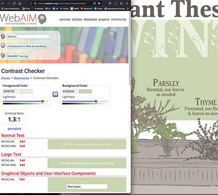
In the example below, WebAim shows the contrast as “FAIL” due to the light green background and the word “Winter” in the title not meeting guidelines. Sometimes a font color can pass at a larger size. WebAim distinguishes font sizes by scale. It considers fonts under 14 points as “Normal” and 14 points or bigger as “Large.”
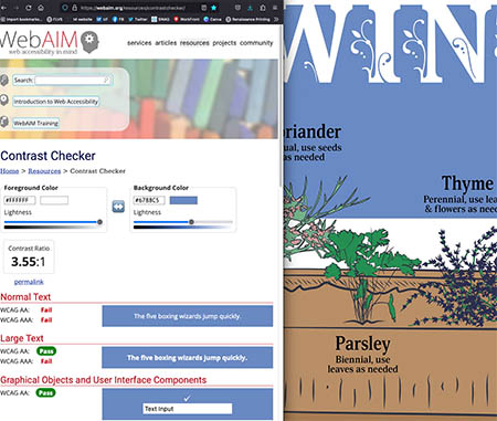
When WebAim tests the contrast between the new background color and the word “Winter” in the title, the result is a “PASS.”
Performing these color contrast checks for all written content is necessary for full compliance.
Sim Daltonism is another helpful tool that you can use. It is an app that acts as a filter which visualizes color as people with various color deficiencies or blindness perceive them. Using this tool develops a better understanding of how color confusion and blindness affect color perception.
In the example below, the colors used are green and blue based. The Sim Daltonism filter makes distinguishing between blue and green hard, simulating a color deficiency. The examples show the filter applied; on the left is the original color scheme, and on the right is the adjusted file that was made ADA-compliant.

Make accessibility a priority and test your documents for color contrast with WebAim and Sim Daltonism to guarantee that your text will be readable by those with color vision deficiencies.
We can Help!
UF/IFAS Communications provides document services that allow your files to be accessible to people with low or no vision. Submit your PDF, Word, and PowerPoint files the ICS Request Form and selecting the ADA Document Accessibility Service.
Learn more here: https://blogs.ifas.ufl.edu/ifascomm/2023/04/25/new-accessible-document-services/
 5
5
