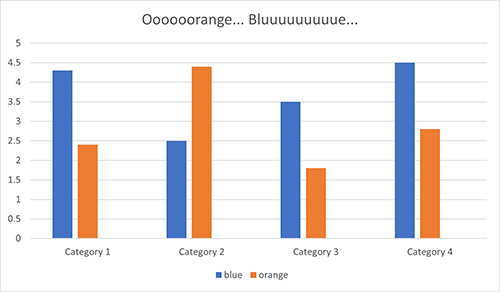
Many EDIS publications use charts and graphs to clarify points and provide a visual representation of data. Charts and graphs can help readers understand complex ideas. Unfortunately, people with low vision and color vision deficits can have trouble if graphs and charts rely on color to convey meaning and if the colors don’t contrast well. Screen readers can’t “see” these graphical elements at all.
Accessible Charts and Graphs for People with Color Vision Deficits
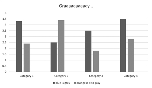
Avoid using color alone to convey meaning. In a chart or graph, this can mean adding texture, like dots or hash marks, or ensuring that colors contrast enough to distinguish them in grayscale. Or simply label everything. If the graph or chart is too “busy” to easily differentiate the different elements with contrasting colors and textures, chances are excellent that even readers with no visual deficits will have trouble understanding it. In those cases, a summary in the caption will help all readers understand.
Accessible Charts and Graphs for Users of Screen Readers
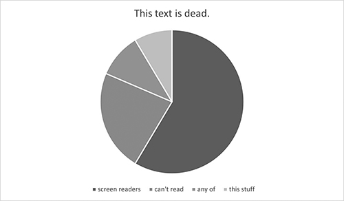
Even if your chart or graph includes clear labels and explanations, if all the explanatory text is inside the image, it will be inaccessible to people who rely on assistive technology like Braille keyboards and screen readers. Screen readers can read the live text associated with graphs, like explanations in the body text, figure captions, and Alt-text, but any text within a figure is “dead.” It’s just a wash of pixels that the assistive technology can’t discern as text.
Alt-text and captions
Unless you take the time to give it more to work with, the screen reader is going to sum up the chart you labored over in one word: “figure.” The person using the screen reader will know only that their assistive technology has encountered a graphic of some kind, so the first thing to do is tell them in the Alt-text what that figure is–a line graph, a Venn diagram, a pie chart.
For simple graphs and charts with smaller data sets and simple interactions, you may be able to explain the ideas conveyed in the Alt-text alone. But Alt-text is limited to under 300 characters, or about 50 words. For more complex charts and graphs, you can use the figure caption to provide a more lengthy explanation and use the Alt-text to simply identify the type of chart or graph it is and provide a short summary.

Matching data tables
If your captions and Alt-text are becoming novellas, consider reproducing the data in a simple, accessible table. Note the verbosity of the above caption compared to the simple tables Word generates from the same data it uses to make charts and graphs. Converting to a table is frequently the best way to make these graphic elements accessible. The EDIS author handbook has more on how to create accessible tables. https://ics.ifas.ufl.edu/media/icsifasufledu/docs/edis/Author-Handbook.pdf
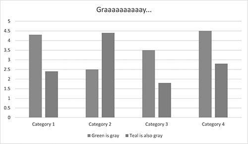
| Categories | Green | Teal |
| Category 1 | 4.3 | 2.4 |
| Category 2 | 2.5 | 4.4 |
| Category 3 | 3.5 | 1.8 |
| Category 4 | 4.5 | 2.8 |
Below I’ve re-rendered the pie chart to be more intelligible for readers who can’t see color. The color contrast issue persists, but I fixed it by tossing the uselessly tiny legend and labeling the pie pieces. For people relying on screen readers, I’ve added a caption explanation and a matching data table. Tip: direct readers to your table first thing so that people can skip the wordy caption.
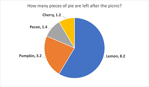
| Pie type | How many pieces of pie are left after the picnic? |
| Lemon | 8.2 |
| Pumpkin | 3.2 |
| Pecan | 1.4 |
| Cherry | 1.2 |
 5
5
