Making your digital content accessible isn’t just a legal requirement under the Americans with Disabilities Act (ADA)—it’s a commitment to . UF/IFAS Communications is your partner in remediating PDFs, preparing blogs, and making recommendations for how to caption your social media posts – but building your content with people with disabilities in mind can help a wider audience engage with your message. When things are accessible, everybody benefits!
Here are a few essential things to consider:
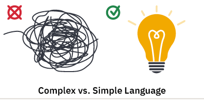
- Use Clear, Simple Language
Write in plain language whenever possible. Avoid jargon, acronyms, or complex sentence structures that may confuse users with cognitive disabilities or those using screen readers.
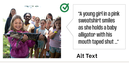
- Add Alt Text to Images
Alternative (alt) text describes the content of an image for users who can’t see it. Alt text should be concise and meaningful—conveying the image’s purpose, not just its appearance. In this example, the text reads “A young girl in a pink sweatshirt smiles as she holds a baby alligator with his mouth taped shut.”
Alt text blog post
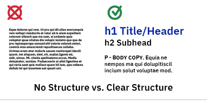
- Use Proper Headings and Structure
Organize content using heading tags (H1, H2, etc.) in a logical order. The document title should be largest, then elements get gradually smaller in size – subheads, then body copy, then captions, then fine print should be smallest. This will also help with creating a table of contents in longer documents and allows screen readers to interpret and navigate your page more easily.
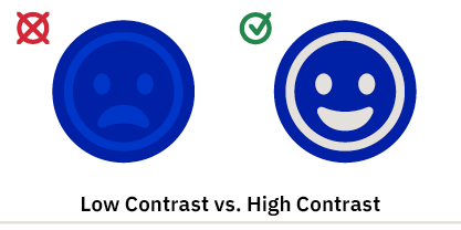
- Consider Color Contrast
Make sure text and background colors have enough contrast to be readable for users with low vision or color blindness. Online tools can help with this – check these out:
Web based Web AIM
App based TPGI
- Check Out Available Resources
UF’s training page
ICS training webinars
ADA document service blog post
Accessibility is an Ongoing Effort
ADA compliance isn’t a one-and-done checkbox—it’s an ongoing process of education, design, and testing. By centering accessibility from the start, you ensure your content reaches a wider audience and reflects a true commitment to equity and inclusion. ICS is here to help – submit an Asana Request to our ADA Specialist when your document is completed!
 2
2
